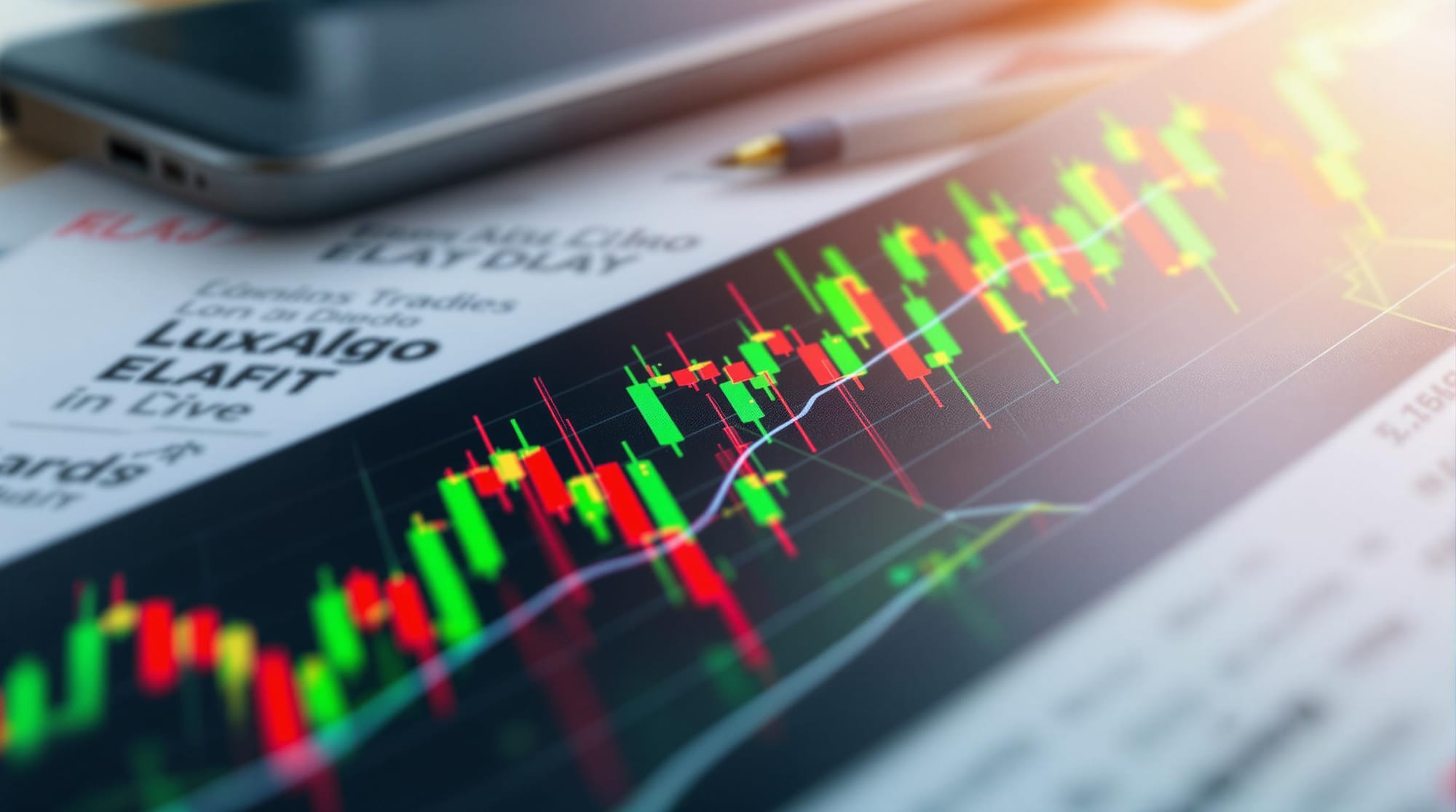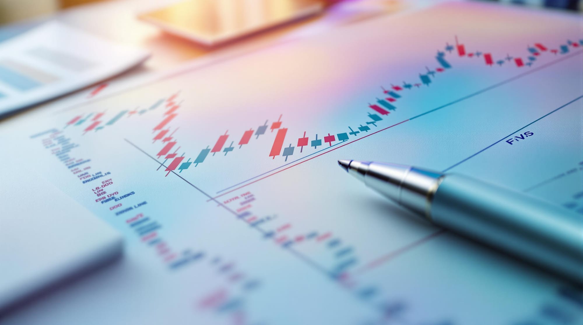
Explore how heatmaps and footprint charts enhance trading strategies by revealing market behavior and order flow insights.
Heatmaps and footprint charts are powerful ways to understand market behavior beyond traditional price charts. Here's what you need to know:
- Heatmaps: Use color gradients to show trading activity. Brighter colors indicate higher activity, helping traders identify support, resistance, and liquidity zones.
- Footprint Charts: Provide detailed volume data at each price level. They show order flow, volume imbalances, and key liquidity zones for deeper market insights.
Key Benefits:
- For Scalpers: Real-time order flow visibility.
- For Day Traders: Intraday price and volume trends.
- For Swing Traders: Identifying critical support/resistance levels.
Quick Comparison:
| Tool | Purpose | Insights Provided |
|---|---|---|
| Heatmaps | Visualize trading intensity | Spot support/resistance and liquidity zones |
| Footprint Charts | Analyze detailed order flow and volume | Detect imbalances, trends, and key price levels |
Related video from YouTube
Heatmaps in Trading

Let’s dive into how heatmaps work and how traders can use them to make more informed decisions.
Heatmap Basics
Heatmaps turn complex market data into easy-to-understand visuals by using color gradients to represent trading activity. Unlike standard OHLC charts, they provide insight into market depth and activity levels. Brighter or "warmer" colors highlight areas of intense activity, while cooler shades show less engagement.
Common Heatmap Types
Different types of heatmaps serve specific purposes in trading analysis:
| Type | Purpose | Trading Insights |
|---|---|---|
| Price Heatmaps | Highlight trading intensity | Pinpoint support/resistance levels |
| Volume Heatmaps | Display trade volume | Identify areas with high market interest |
| Liquidity Heatmaps | Show buy/sell order placement | Optimize execution of large trades |
These features help traders spot important price levels and refine their strategies.
Trading with Heatmaps
Heatmaps can complement technical analysis by providing visual cues about market behavior. Here’s how to use them effectively:
- Watch Color Shifts: Sudden changes in color intensity can signal new trends or reversals.
- Blend with Other Indicators: Combine heatmaps with moving averages, RSI, or support/resistance levels to confirm signals.
- Observe Patterns Over Time: Look for recurring trends across different trading sessions.
For day traders, adjusting heatmap opacity to match session volume can provide clearer insights. Remember, major economic events can disrupt patterns quickly, so always weigh heatmap data against broader market conditions.
Footprint Charts for Order Flow

Heatmaps give you a snapshot of market activity, but footprint charts go deeper by analyzing the order flow that drives price changes.
Footprint Chart Structure
First introduced by MarketDelta in 2003, footprint charts expand on candlestick charts by showing trade volume at each price point.
Here’s a breakdown of their key components:
| Component | Description | Trading Significance |
|---|---|---|
| Bid/Ask Profile | Displays volume at buy and sell prices | Highlights the balance of pressure |
| Delta Print | Tracks the difference between buying and selling volume | Shows which side dominates |
| Volume Profile | Horizontal view of volume distribution | Identifies key liquidity zones |
Reading Footprint Data
To make sense of footprint charts, look for these patterns:
- Volume Imbalances: When buying or selling dominates at specific levels, it often signals upcoming breakouts or reversals.
- Absorption Patterns: Large volumes traded with little price movement suggest the market is absorbing orders, which can signal potential reversals.
- Hot Spots: Areas with heavy trading activity highlight key price levels where major players are active, acting as critical support or resistance.
Trading Benefits
| Benefit | Application | Impact |
|---|---|---|
| Real-time Order Flow | Instant visibility into activity | Speeds up decision-making |
| Volume Distribution | Shows liquidity levels clearly | Improves entry and exit timing |
| Market Sentiment | Visualizes buyer vs. seller pressure | Enhances trend analysis |
Footprint charts expose situations where traders are trapped or reacting to specific conditions, helping anticipate market shifts. Focus on spotting unfinished auctions and analyzing delta prints to gauge market strength. Compared to traditional charts, footprint charts offer a deeper view of order flow.
Trading Strategy Implementation
Heatmap Trading Techniques
- Dark red: Indicates a potential long entry near support levels.
- Deep blue: Suggests a potential short entry near resistance.
- Gradual transitions: Reflect evolving market sentiment.
Footprint Chart Techniques
Use footprint charts to detect accumulation or distribution zones and spot shifts in order flow that often precede price movements. This can confirm trend changes with greater accuracy.
Combining Heatmaps and Footprint Charts
- Use heatmaps to identify broader market trends.
- Confirm with order-flow data from footprint charts.
- Look for alignment between both for stronger signals.
- Adjust time frames to match current volatility.
- Watch for overlaps between heatmap clusters and footprint patterns.
For even more precision, consider adding LuxAlgo’s Signals & Overlays toolkit, which offers advanced signal overlays and validation features.
Advanced Usage Tips
Combining with Technical Indicators
Pair heatmaps and footprint charts with moving averages, RSI, and support/resistance levels. This layered approach improves trend confirmation and volume analysis, helping you spot trading opportunities while reducing false signals.
Avoiding Common Mistakes
Avoid treating high liquidity zones as solid support or resistance without context. Don’t analyze heatmap data in isolation—economic announcements or sudden market shifts can change the picture quickly.
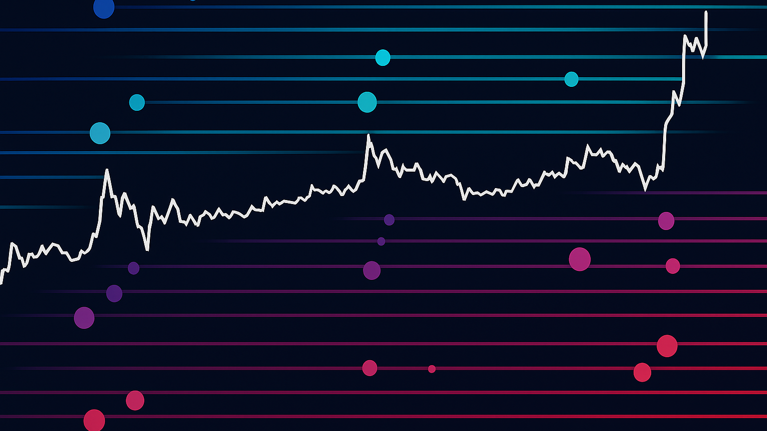
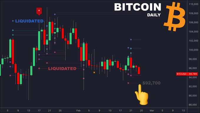
LuxAlgo Liquidation Levels
The Liquidation Levels indicator detects and estimates potential price levels where large liquidation events may occur. By analyzing clusters of high-leverage positions, it helps traders identify key support & resistance levels, set effective stop-losses, gauge market sentiment, and highlight zones of potential high volatility.
Bubbles appear on the relevant price bars when significant trading activity is detected; larger bubbles represent more critical liquidation levels. Lines extending from the bubbles mark the liquidation zones. By default, the indicator considers leverage clusters of 100x, 50x, and 25x, all of which can be customized or removed in the settings. Price often gravitates toward these liquidity clusters, offering anticipatory signals for market moves.
The indicator settings allow you to adjust:
- Reference Price: Base price used for calculations.
- Volume Threshold: Minimum activity required to show bubbles.
- Volatility Threshold: Secondary filter for price movements with lower volume.
- Leverage Options: Choose or customize leverage levels and their display colors.
- Visibility Toggles: Show or hide liquidation bubbles and lines.
Summary
Key Points Review
Visual analytics transform market analysis by revealing order activity and volume patterns. Heatmaps spotlight large-scale trading intensity, and footprint charts break down volume distribution across prices. Together, they offer a comprehensive view of market depth and flow.
Getting Started Steps
- Pick the Right Plan
Start with LuxAlgo Premium for heatmaps and liquidation levels indicators. - Learn Core Concepts
Understand color gradients, volume profiles, delta prints, and liquidation zones. - Practice
Use paper trading to test heatmap shifts, footprint patterns, and liquidation signals. - Refine
Adjust time frames, tweak settings, and review performance regularly.